
Fellow
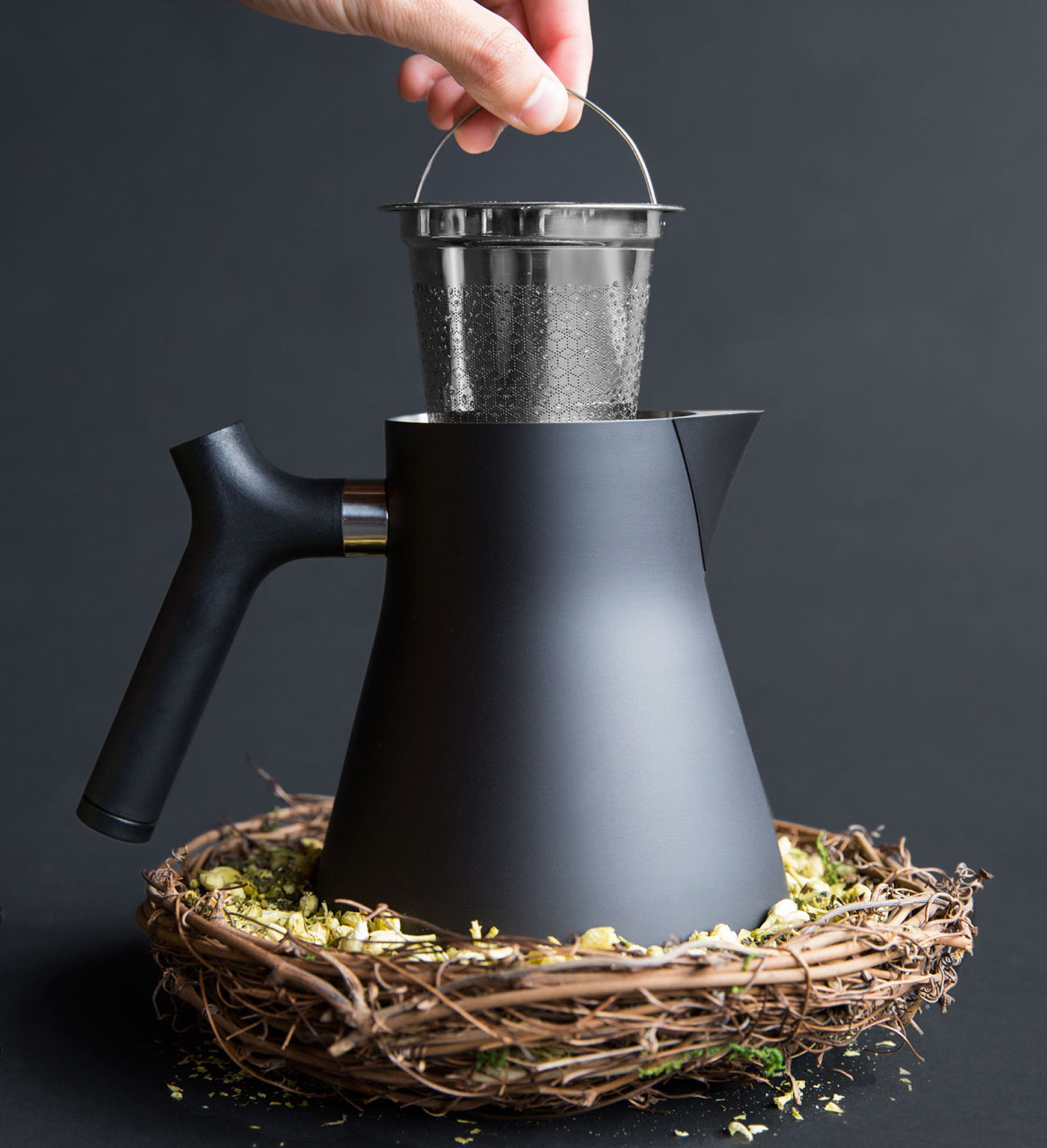
When a love for coffee meets a passion for product design, the result is Fellow. This San Francisco start-up set out to launch a product line that demanded a bold and memorable identity, one that would capture both sophistication and approachability.
The challenge was clear: how to craft a high-end brand that resonates with discerning coffee enthusiasts without tipping into pretension. Fellow wanted to embody the voice of a trusted friend - knowledgeable yet relatable. Even the name was chosen to evoke camaraderie, while a touch of wit in copy and photography strengthens that human connection.
Central to this vision was designing a logotype that performs across every medium: digital, print, and packaging, while also adapting seamlessly to physical applications on metal, plastics, and wood tooling. This flexibility ensures that the identity feels cohesive and premium, no matter the context.
The resulting brandmark delivers on that promise: a symbol of guidance and trust, elevated but never snobbish..
Logotype & Identity - Packaging
More info Fellow.


OUTCOME & IMPACTThe cohesive brand identity has:
Positioned Fellow as a leading lifestyle brand in coffee.
Strengthened their emotional connection with users through consistent visual, social, and experiential storytelling.
Garnered acclaim and design awards (e.g. Red Dot for products like the Ode Grinder and Carter Move Mug)